
Table of Contents
I. What Gets Measured Gets Managed
Quality issues rarely crash in like a thunderstorm. They creep in, bit by bit.
One bad part today. A few more tomorrow. By the time you notice, the damage is done—defects, rework, late orders, and angry customers.
Real-world example: A production line starts making slightly oversized parts. Nobody sees the trend. Two weeks later, a full batch gets scrapped. Thousands lost—because no one tracked the pattern.
“Without data, you’re just another person with an opinion.” – W. Edwards Deming
That’s why control charts matter. They don’t just collect data. They tell you when something’s going wrong—before it explodes.
II. What Is a Control Chart? (Plain English Version)
A control chart is a simple line graph that shows how a process performs over time.
It helps you answer one question:
“Is my process stable, or is something off?”
It plots data points—like product weight, cycle time, defect rate—and compares them against limits. These limits tell you what’s normal and what’s not.
Think of it like a health monitor for your process. You don’t wait for a heart attack to check your pulse.
Control charts were invented by Walter A. Shewhart at Bell Labs in the 1920s. They were the first real tool in what we now call statistical process control (SPC).
Almost 100 years later, they’re still one of the most powerful tools in lean and quality management.
III. Why Control Charts Matter
Control charts do more than draw lines on a graph. They let you:
✅ Spot problems early
- You don’t wait for a crisis—you catch the drift before it becomes a disaster.
✅ Tell noise from signal
- Not every fluctuation means failure. Charts help you separate random variation (normal) from special causes (trouble).
✅ Reduce waste and rework
- Fixing issues before they spiral saves time, money, and materials.
✅ Boost quality and consistency
- When the process stays in control, the product stays on spec.
Stat: Companies that actively use control charts often reduce quality issues by 40–60% within months.
Simple chart. Huge impact.
IV. What’s on a Control Chart? (Break It Down)

A control chart isn’t complicated once you know what to look for.
Here’s what it shows:
🟡 Center Line (CL)
This is your average performance—your “normal.”
🔼 Upper Control Limit (UCL)
The highest safe value your process should reach. Go above this? Something’s wrong.
🔽 Lower Control Limit (LCL)
The lowest safe value before things go off track.
🔹 Data Points Over Time
Plotted daily, hourly, per batch—whatever fits your process.
🚩 Visual Flags
Look for:
- Trends (e.g., slow drift up or down)
- Spikes (sudden jumps)
- Runs (several points on one side of the average)
These patterns tell you when to act.
Think of a control chart like a speedometer for your process. It tells you if you’re cruising steady—or heading for a breakdown.
V. Types of Control Charts (Keep It Simple)
Different charts track different types of data. Here are the four you’ll use most:
📊 X̄ Chart
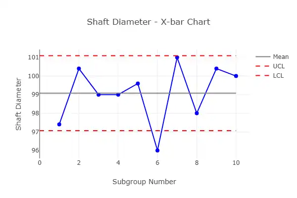
Tracks averages.
Example: Average weight of a packaged product every hour.
📉 R Chart
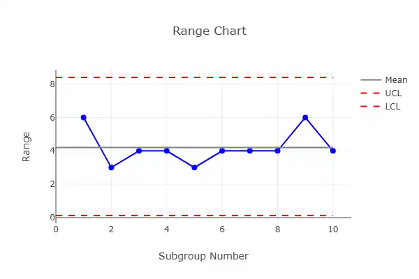
Tracks range or variation within each sample.
Example: Difference between the heaviest and lightest items in a batch.
✅ P Chart
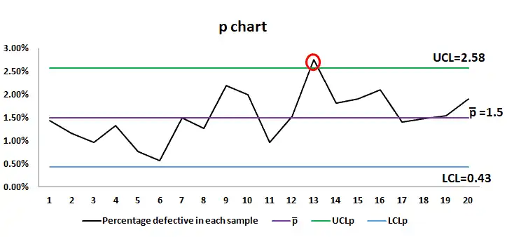
Used for pass/fail or yes/no data.
Example: % of units that failed inspection.
🔢 C Chart
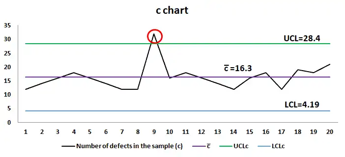
Counts number of defects per unit or batch.
Example: Number of scratches on a panel.
Tip: Use the chart that fits your data. Don’t overthink it—start with the basics and expand as needed.
VI. Real-World Examples
📞 Call Center: Spotting Trouble Before Customers Do
A call center tracks average wait time with an X̄ chart. One week, they spot a slow climb in call times—well before customers start complaining.
Fix: Add staff, adjust schedules. Problem solved before it hits service quality.
🛠️ Parts Factory: Catching Machine Drift Early
A parts supplier uses an X̄ and R chart to monitor a drilling machine.
They notice a steady shift in hole diameter. It’s still in spec—but getting close to the limit.
Fix: Maintenance tweaks the machine. No bad parts leave the floor.
VII. Common Mistakes to Avoid
Even a solid tool like a control chart can fall flat if used wrong. Here’s what to watch out for:
❌ Overreacting to Normal Variation
Not every dip or bump means disaster. Control limits exist so you don’t panic at every little change.
❌ Using Too Small a Sample Size
A few data points won’t tell you the full story. You need enough to see the pattern, not just the noise.
❌ Ignoring the Data
Some teams make the chart, hang it up—and never look at it again.
✅ The Fix:
Train your team to read the chart—not just collect the numbers.
It’s not just a record. It’s a warning system.
VIII. Control Chart = Visual Clarity
A control chart turns raw data into decisions.
- Instead of guessing, you see the trend.
- Instead of reacting late, you act early.
- Instead of endless meetings, you point to the line and say, “Here’s the problem.”
It pairs perfectly with:
Charts bring clarity. Clarity drives action.
IX. Wrap-Up: Know What’s Normal, Fix What’s Not
Control charts are not high-tech. They’re not hard to use. But they make your process visible, predictable, and stable.
They tell you if your system is healthy—or heading for a breakdown.
You don’t need to wait for a disaster. With a control chart, you’ll see the warning signs coming.
Final stat: Plants that use control charts well often cut production issues by up to 50% in just a few months.
Simple tool. Massive impact.
The 7 tools of quality | Certification Course
Buy Now for $17.49
Udemy prices may vary depending on applied coupons and promotional events.
- 🧑🏫 43 lectures
- ⌚ 3h 30m total length
- 🗃️ 9 downloadable resources
- 📜 Certificate of completion
- 👩🎓 9,240 students
- ⭐ 4.7 rating by 146 students