

Table of Contents
Introduction
Quality Control (QC) tools play a crucial role in the field of quality management. These tools help organizations maintain quality standards and improve processes, ensuring that products and services meet customer expectations. In this article, we will explore the seven essential QC tools: Cause & Effect Diagrams, Check Sheets, Control Charts, Histograms, Pareto Charts, Scatter Diagrams, and Stratification Charts. Let’s dive into their definitions, importance, and how they originated.
Overview of Quality Control (QC) Tools
Definition and Importance of QC Tools in Quality Management
Quality Control tools are systematic techniques used to analyze, monitor, and improve processes. They help identify defects, understand variations, and find solutions to ensure consistent quality. These tools are vital because they:
- Enhance productivity by identifying bottlenecks.
- Reduce costs by minimizing waste and rework.
- Improve customer satisfaction by ensuring high-quality products and services.
- Facilitate data-driven decision-making.
Brief History and Origin of the 7 QC Tools
The seven QC tools have their roots in the post-World War II era, primarily developed in Japan. They were popularized by Kaoru Ishikawa, a Japanese professor and quality management innovator. Ishikawa believed that 95% of quality-related problems could be solved using simple graphical tools, which led to the widespread adoption of these seven tools in various industries.
The Role of These Tools in Various Industries
These QC tools are not confined to manufacturing alone. They have found applications in numerous industries, including healthcare, finance, education, and service sectors. For instance:
- In healthcare, QC tools help in reducing medical errors and improving patient care.
- In finance, they assist in analyzing transaction patterns and detecting fraud.
- In education, they aid in tracking student performance and identifying areas for improvement.
- In the service sector, they help in monitoring customer feedback and enhancing service quality.
By implementing these QC tools, organizations across different sectors can achieve higher efficiency, better quality control, and improved overall performance.
QC Tools 1: Cause & Effect Diagrams
Basics of Cause & Effect Diagrams
Definition and Purpose
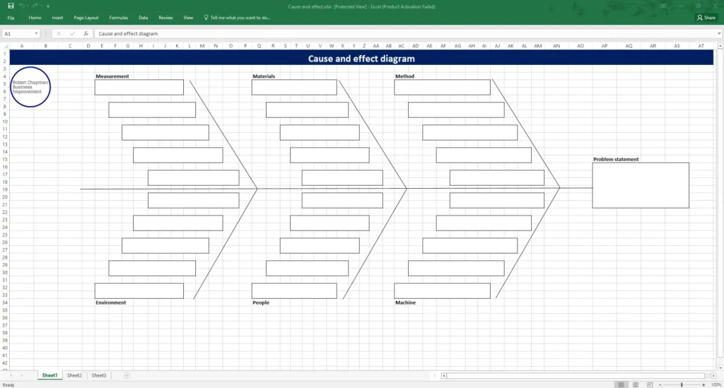
A Cause & Effect Diagram, also known as a Fishbone or Ishikawa Diagram, is a visual tool used to systematically identify and present possible causes of a specific problem. The primary purpose is to identify root causes of defects or issues, helping teams address the underlying problems rather than just the symptoms.
Explanation of the Fishbone (Ishikawa) Diagram
The Fishbone Diagram gets its name because it resembles a fish skeleton. The main problem or effect is placed at the “head” of the fish, while the potential causes are listed along the “bones” branching off from the spine. These causes are typically grouped into major categories such as Methods, Machinery, People, Materials, Measurement, and Environment, making it easier to visualize and analyze the factors contributing to the problem.
Creating a Cause & Effect Diagram
Step-by-Step Guide
- Identify the Problem: Clearly define the problem or effect you are trying to analyze. Write it down at the head of the fish.
- Draw the Backbone: Draw a straight line horizontally across the page, leading to the problem statement.
- Determine Major Categories: Decide on the major categories of potential causes related to the problem. These can be the traditional categories like Methods, Machinery, People, Materials, Measurement, and Environment or any other relevant to your situation.
- Brainstorm Causes: For each category, brainstorm potential causes and draw branches off the main spine. Add sub-branches for more detailed causes.
- Analyze the Diagram: Review the diagram to identify the most likely root causes. Prioritize which causes to address first based on their impact on the problem.
Tips for Effective Brainstorming Sessions
- Encourage Open Communication: Make sure everyone feels comfortable sharing their ideas without judgment.
- Stay Focused: Keep the discussion centered on identifying causes related to the problem.
- Use Visual Aids: Sticky notes or whiteboards can help visualize ideas better.
- Time Management: Allocate specific times for brainstorming to keep the session productive and focused.
Applications and Examples
Real-Life Examples from Different Industries
In manufacturing, a Cause & Effect Diagram might be used to identify reasons for defects in a production line. For instance, if there are frequent defects in a car assembly, the diagram might reveal that improper training (People) and outdated machinery (Machinery) are significant contributors.
In healthcare, a hospital might use this diagram to identify causes of patient readmissions. Factors like insufficient patient education (Methods) and inadequate follow-up procedures (Processes) might emerge as key issues.
Case Studies Showcasing Problem-Solving Using Cause & Effect Diagrams
Consider a case study from a software development company facing frequent project delays. By using a Cause & Effect Diagram, they identified major causes such as unclear requirements (Methods), inadequate testing tools (Machinery), and team skill gaps (People). Addressing these root causes helped streamline their processes and reduce delays.
Advanced Tips and Hacks
Techniques for Prioritizing Causes
Once you have a list of potential causes, it’s essential to prioritize them. One effective method is to use the Pareto Principle (80/20 rule), which suggests that 80% of problems are often due to 20% of the causes. Focus on these critical few causes first.
Integrating with Other QC Tools for Comprehensive Analysis
To get a more comprehensive view, integrate the Cause & Effect Diagram with other QC tools. For example, use Check Sheets to gather data on how frequently certain causes occur, or apply Control Charts to monitor processes over time. Combining these tools provides a more robust analysis, ensuring that solutions are well-informed and effective.
QC Tools 2: Check Sheets
Basics of Check Sheets
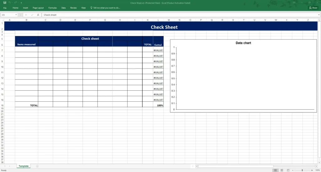
Definition and Types of Check Sheets
Check Sheets are simple, structured forms used to collect and analyze data systematically. They help in recording data in real-time at the location where the data is generated. There are several types of check sheets, including:
- Tally Sheets: Used to count occurrences of events or defects.
- Frequency Distribution Sheets: Record how often each value in a set of data occurs.
- Defect Location Sheets: Help identify where defects occur in a product.
- Checklists: Ensure that all steps in a process are followed.
Importance in Data Collection and Analysis
Check Sheets are crucial because they provide a straightforward way to gather and organize data. This data can then be analyzed to identify trends, patterns, and areas for improvement. They help in:
- Ensuring accuracy and consistency in data collection.
- Simplifying the data analysis process.
- Facilitating quick decision-making based on real-time data.
- Highlighting areas that need attention or improvement.
Designing Effective Check Sheets
Key Elements to Include
To design an effective check sheet, consider including the following elements:
- Title and Purpose: Clearly state what the check sheet is for.
- Date and Time: Record when the data is collected.
- Location: Specify where the data collection occurs.
- Categories: Define the categories or types of data to be collected.
- Data Fields: Include fields for recording the data.
- Instructions: Provide clear instructions on how to use the check sheet.
Customizing Check Sheets for Specific Needs
Every process or project might have unique requirements. Customize your check sheets to fit these needs by:
- Including specific data categories relevant to your process.
- Adjusting the format to suit the data collection method (e.g., paper-based or digital).
- Adding sections for additional notes or observations.
Applications and Examples
Real-World Examples and Case Studies
In manufacturing, check sheets are widely used to monitor defects on the production line. For instance, a company producing electronic components might use a Defect Location Sheet to track where faults occur in the assembly process. This data can then be used to pinpoint which stage needs improvement.
In healthcare, check sheets help ensure that all steps in a patient care protocol are followed. For example, a surgical checklist might include steps like confirming patient identity, marking the surgical site, and ensuring all equipment is sterilized.
Common Pitfalls and How to Avoid Them
Some common pitfalls when using check sheets include:
- Incomplete Data Collection: Ensure that all required fields are filled out accurately.
- Lack of Standardization: Standardize the format and instructions to ensure consistency.
- Inadequate Training: Train the staff on how to use the check sheets properly.
- Ignoring Collected Data: Regularly review and analyze the data to make informed decisions.
Advanced Tips and Hacks
Automating Data Collection with Digital Tools
Modern digital tools can automate data collection, making the process more efficient and reducing the chances of human error. Tools like mobile apps or specialized software can:
- Automatically record data inputs.
- Generate real-time reports.
- Integrate with other data analysis tools.
Using digital check sheets saves time and allows for more sophisticated data analysis.
Using Check Sheets for Root Cause Analysis
Check sheets can also be used in root cause analysis. By collecting detailed data on when and where defects occur, you can:
- Identify patterns that suggest underlying issues.
- Combine this data with other QC tools like Cause & Effect Diagrams to find root causes.
- Implement targeted solutions to address these issues.
By leveraging check sheets effectively, organizations can enhance their data collection and analysis processes, leading to better quality control and continuous improvement in their operations.
QC Tools 3: Control Charts
Basics of Control Charts
Definition and Types (X-bar, R, p, np, c, u Charts)
Control Charts are graphical tools used to monitor the stability and performance of processes over time. They help identify variations that may signal problems needing attention. There are several types of control charts, each serving different purposes:
- X-bar and R Charts: Used for monitoring the mean (X-bar) and range (R) of a process over time.
- p and np Charts: Used for monitoring the proportion of defective items in a sample (p charts) or the number of defective items (np charts).
- c and u Charts: Used for monitoring the count of defects per unit (c charts) or the average number of defects per unit (u charts).
The Concept of Control Limits
Control Limits are the boundaries on a control chart that define the acceptable range of variation in a process. They consist of:
- Upper Control Limit (UCL): The highest value a process should reach under normal conditions.
- Lower Control Limit (LCL): The lowest value a process should reach under normal conditions.
If data points fall within these limits, the process is considered to be in control. Points outside these limits indicate potential issues that may require investigation.
Creating Control Charts
Step-by-Step Guide to Constructing Control Charts
- Select the Type of Control Chart: Choose the appropriate chart based on the type of data and the aspect of the process you want to monitor.
- Collect Data: Gather data points over a specified period.
- Calculate the Mean and Range (if applicable): For X-bar and R charts, calculate the mean and range of the data.
- Determine Control Limits: Calculate the UCL and LCL based on statistical formulas specific to the type of chart.
- Plot the Data: Plot the data points on the chart, along with the control limits.
- Analyze the Chart: Look for patterns or points outside the control limits that indicate process variations.
Interpretation of Control Chart Patterns
Interpreting control charts involves looking for specific patterns, such as:
- Out-of-Control Points: Points outside the control limits.
- Runs: Consecutive points on one side of the mean.
- Trends: Continuous upward or downward movement.
- Cycles: Regular patterns that repeat over time.
These patterns can indicate issues like shifts in the process mean, increasing variability, or other systematic problems.
Applications and Examples
Real-Life Applications in Manufacturing and Service Industries
In manufacturing, control charts are used to monitor processes like assembly line production. For example, an X-bar chart might track the average weight of a product batch to ensure it meets specifications.
In the service industry, control charts can monitor processes like customer service response times. A p chart might track the proportion of customer complaints resolved within a given time frame.
Case Studies Demonstrating Process Improvement
Consider a case study from a pharmaceutical company using control charts to monitor the pill coating process. By implementing X-bar and R charts, they identified a trend of increasing variability in coating thickness. Further investigation revealed that a machine calibration issue was the cause. Correcting this issue led to more consistent product quality.
Advanced Tips and Hacks
Using Software Tools for Control Chart Creation
Several software tools can simplify the creation and analysis of control charts, including:
- Minitab: A comprehensive statistical software.
- SPC for Excel: An add-on for creating control charts within Excel.
- JMP: A data analysis tool with robust SPC capabilities.
These tools automate calculations, plot charts, and provide advanced analysis options, making it easier to maintain and interpret control charts.
Integrating Control Charts with Other QC Tools for Continuous Improvement
Control charts can be integrated with other QC tools to enhance continuous improvement efforts. For example:
- Fishbone Diagrams: Use control chart data to identify root causes of variability.
- Pareto Charts: Prioritize the most significant issues highlighted by control charts.
By combining these tools, organizations can gain deeper insights into process performance and implement more effective solutions for quality improvement.
Control charts are powerful tools for monitoring and maintaining process stability. When used effectively, they help organizations identify and address variations, leading to improved quality and efficiency.
QC Tools 4: Histograms
Basics of Histograms
Definition and Purpose
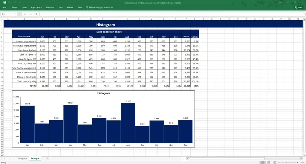
A Histogram is a type of bar graph that represents the frequency distribution of a dataset. It provides a visual representation of the distribution, central tendency, and variability of the data. The primary purpose of a histogram is to give a clear picture of the underlying frequency distribution of the data, making it easier to identify patterns, trends, and potential outliers.
Understanding Frequency Distribution
Frequency distribution is a summary of how often each value occurs within a dataset. In a histogram, the data is grouped into intervals, called bins, and the height of each bar represents the frequency of data points within that bin. This allows for a quick assessment of the distribution characteristics, such as skewness, kurtosis, and the presence of any gaps or clusters.
Constructing Histograms
Step-by-Step Guide
- Collect Data: Gather the dataset you want to analyze.
- Sort the Data: Organize the data in ascending order.
- Determine the Range: Calculate the range by subtracting the smallest value from the largest value.
- Decide on the Number of Bins: Choose the number of bins (intervals) to divide the data into. A common rule of thumb is to use the square root of the number of data points.
- Calculate Bin Width: Divide the range by the number of bins to determine the width of each bin.
- Create Bins: Establish the intervals (bins) based on the bin width calculated.
- Count Frequencies: Tally the number of data points that fall into each bin.
- Draw the Histogram: Plot the bins on the horizontal axis and the frequencies on the vertical axis. Draw bars for each bin with heights corresponding to the frequencies.
Choosing Appropriate Bin Widths
Selecting the right bin width is crucial for an accurate histogram. If the bins are too wide, important details may be lost, and the histogram may appear too generalized. If the bins are too narrow, the histogram may be too detailed and noisy.
A good approach is to experiment with different bin widths and choose the one that best reveals the underlying distribution without oversimplifying or overcomplicating the data.
Applications and Examples
Examples from Various Industries
In manufacturing, histograms are used to analyze the distribution of product dimensions, such as the diameter of bearings. This helps ensure products meet specified tolerances and quality standards.
In healthcare, histograms can be used to analyze patient wait times. By visualizing the distribution of wait times, hospitals can identify peak periods and optimize staffing levels.
Case Studies Showing the Impact of Histograms on Quality Control
Consider a case study from a food processing company. They used histograms to analyze the weight distribution of packaged products. Initially, the histogram revealed a significant number of underweight and overweight packages. By adjusting the filling process, the company was able to achieve a more uniform weight distribution, reducing product waste and improving customer satisfaction.
Advanced Tips and Hacks
Using Histograms for Predictive Analysis
Histograms can be used for predictive analysis by identifying trends and patterns in historical data. For example, in sales forecasting, a histogram of past sales data can help predict future demand patterns, enabling better inventory management and production planning.
Combining Histograms with Other QC Tools for Deeper Insights
Histograms can be combined with other QC tools to gain deeper insights into quality issues. For instance:
- Pareto Charts: Use histograms to identify the most common defects, then apply Pareto analysis to prioritize the most critical issues.
- Control Charts: Use histograms to understand the distribution of process outputs and set appropriate control limits.
By integrating histograms with other QC tools, organizations can perform more comprehensive analyses, leading to more effective quality control and process improvements.
Histograms are essential tools for visualizing and understanding the frequency distribution of data. When used effectively, they provide valuable insights into process performance and variability, helping organizations improve quality and efficiency.
QC Tools 5: Pareto Charts
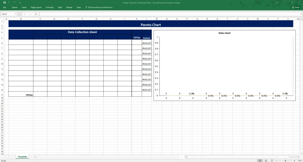
Basics of Pareto Charts
Definition and the Pareto Principle (80/20 Rule)
A Pareto Chart is a bar graph that represents the frequency or impact of problems or causes in descending order. It is based on the Pareto Principle, also known as the 80/20 rule, which states that roughly 80% of effects come from 20% of causes. This principle is instrumental in identifying the most significant factors contributing to a problem.
Importance in Prioritizing Issues
Pareto Charts are vital for prioritizing issues because they help identify the few critical causes that contribute most to a problem. By focusing on these key causes, organizations can achieve the most significant improvements with the least effort. This targeted approach ensures that resources are used efficiently and effectively.
Creating Pareto Charts
Step-by-Step Guide
- Identify the Problem: Clearly define the issue you want to analyze.
- Collect Data: Gather data on the frequency or impact of each cause related to the problem.
- Sort Data: Organize the data in descending order of frequency or impact.
- Calculate Cumulative Percentages: Determine the cumulative percentage for each cause.
- Draw the Chart: Plot the causes on the horizontal axis and the frequencies on the vertical axis. Draw bars for each cause, arranging them from the highest to the lowest. Add a line graph to show the cumulative percentage.
Identifying and Categorizing Causes
To create an effective Pareto Chart, it’s crucial to identify and categorize causes accurately. Use tools like brainstorming sessions, Fishbone Diagrams, or Check Sheets to gather comprehensive data. Group related causes into categories if needed to simplify the analysis and make the chart more readable.
Applications and Examples
Real-Life Examples from Different Sectors
In manufacturing, a Pareto Chart might be used to identify the most common defects in a production line. For instance, if a factory produces furniture, the chart could reveal that 80% of defects are due to issues like poor wood quality and faulty assembly.
In customer service, a Pareto Chart can help identify the most frequent types of customer complaints. A telecommunications company might find that 80% of complaints are related to billing errors and network issues.
Case Studies Highlighting the Effectiveness of Pareto Charts
Consider a case study from an automotive company facing high warranty claims. By using a Pareto Chart, they discovered that most claims were due to a few specific issues like brake failures and engine problems. Addressing these key issues led to a significant reduction in warranty claims, saving the company millions of dollars.
Advanced Tips and Hacks
Leveraging Software for Dynamic Pareto Analysis
Several software tools can facilitate dynamic Pareto analysis, including:
- Excel: Offers templates and functions to create Pareto Charts easily.
- Minitab: Provides advanced features for creating and analyzing Pareto Charts.
- Tableau: Enables interactive and dynamic visualization of Pareto analysis.
Using these tools, you can automate data collection, update charts in real-time, and perform more sophisticated analyses.
Using Pareto Charts in Conjunction with Other Tools for Strategic Planning
Pareto Charts are even more powerful when combined with other QC tools. For example:
- Control Charts: Use Pareto analysis to identify the most significant sources of variation, then monitor these with control charts.
- Root Cause Analysis: After identifying key issues with Pareto Charts, use tools like Fishbone Diagrams to drill down into root causes.
By integrating Pareto Charts with other tools, organizations can develop comprehensive strategies for quality improvement and problem-solving.
Pareto Charts are indispensable tools for identifying and prioritizing issues. By focusing on the most critical causes, organizations can achieve significant improvements in quality and efficiency, ensuring that resources are used where they will have the most impact.
QC Tools 6: Scatter Diagrams
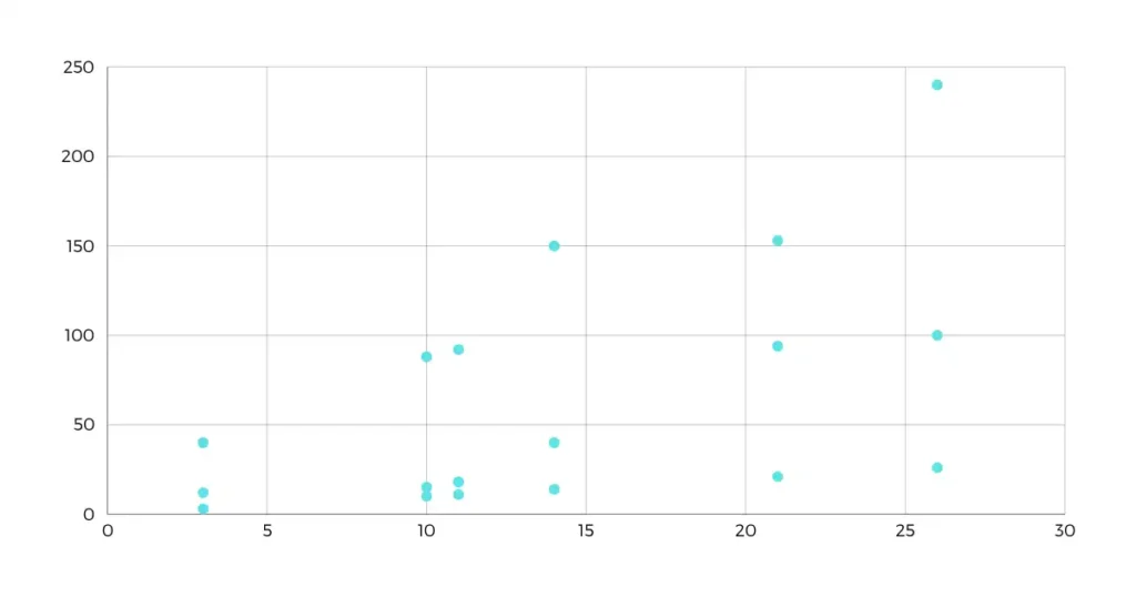
Basics of Scatter Diagrams
Definition and Purpose
A Scatter Diagram, also known as a Scatter Plot, is a graphical tool used to display and analyze the relationship between two variables. Each point on the scatter diagram represents a pair of values. The primary purpose is to identify potential correlations between the variables, helping to understand how one variable may affect the other.
Understanding Correlation and Causation
Correlation refers to a statistical relationship between two variables. In a scatter diagram, a correlation is observed when points form a discernible pattern, such as a line or curve. However, it’s crucial to distinguish correlation from causation. Causation implies that changes in one variable directly cause changes in another, which is not automatically inferred from correlation alone. Additional analysis is required to establish causation.
Constructing Scatter Diagrams
Step-by-Step Guide
- Identify the Variables: Choose the two variables you want to analyze.
- Collect Data: Gather paired data points for the variables.
- Draw the Axes: Label the horizontal axis (X-axis) for one variable and the vertical axis (Y-axis) for the other.
- Plot the Data Points: For each pair of values, mark a point on the diagram where the X and Y values intersect.
- Analyze the Pattern: Look for patterns or trends in the plotted points to determine if a correlation exists.
Interpretation of Scatter Patterns
- Positive Correlation: Points slope upwards from left to right, indicating that as one variable increases, the other also increases.
- Negative Correlation: Points slope downwards from left to right, indicating that as one variable increases, the other decreases.
- No Correlation: Points appear randomly scattered with no discernible pattern, indicating no relationship between the variables.
- Curvilinear Relationship: Points form a curved pattern, indicating a more complex relationship.
Applications and Examples
Real-World Examples from Various Fields
In manufacturing, scatter diagrams can be used to analyze the relationship between machine speed and the number of defects. A positive correlation might indicate that higher speeds lead to more defects, suggesting a need to optimize machine settings.
In healthcare, scatter diagrams can help understand the relationship between patient age and recovery time. A scatter plot could reveal trends that assist in tailoring treatments for different age groups.
Case Studies Illustrating Problem-Solving Using Scatter Diagrams
Consider a case study from a retail company analyzing the relationship between customer satisfaction scores and sales revenue. By plotting these variables on a scatter diagram, they identified a positive correlation. This insight led to initiatives focused on improving customer service, which in turn increased revenue.
Advanced Tips and Hacks
Using Scatter Diagrams for Regression Analysis
Scatter diagrams are often used as a preliminary step in regression analysis, which involves fitting a line (regression line) through the data points to quantify the relationship between variables. Regression analysis can provide:
- Prediction: Estimating the value of one variable based on the value of another.
- Understanding: Quantifying the strength and direction of the relationship.
Integrating with Other QC Tools for Comprehensive Analysis
Scatter diagrams can be combined with other QC tools to enhance analysis:
- Control Charts: Use scatter diagrams to identify relationships between process variables and outcomes, then monitor these variables with control charts.
- Fishbone Diagrams: After identifying correlations with scatter diagrams, use Fishbone Diagrams to explore potential root causes of issues.
By integrating scatter diagrams with other QC tools, organizations can gain a more holistic understanding of their processes, leading to more informed decision-making and effective problem-solving.
Scatter diagrams are powerful tools for visualizing and analyzing relationships between variables. When used effectively, they provide valuable insights that can drive quality improvements and process optimization across various fields.
QC Tools 7: Stratification Charts
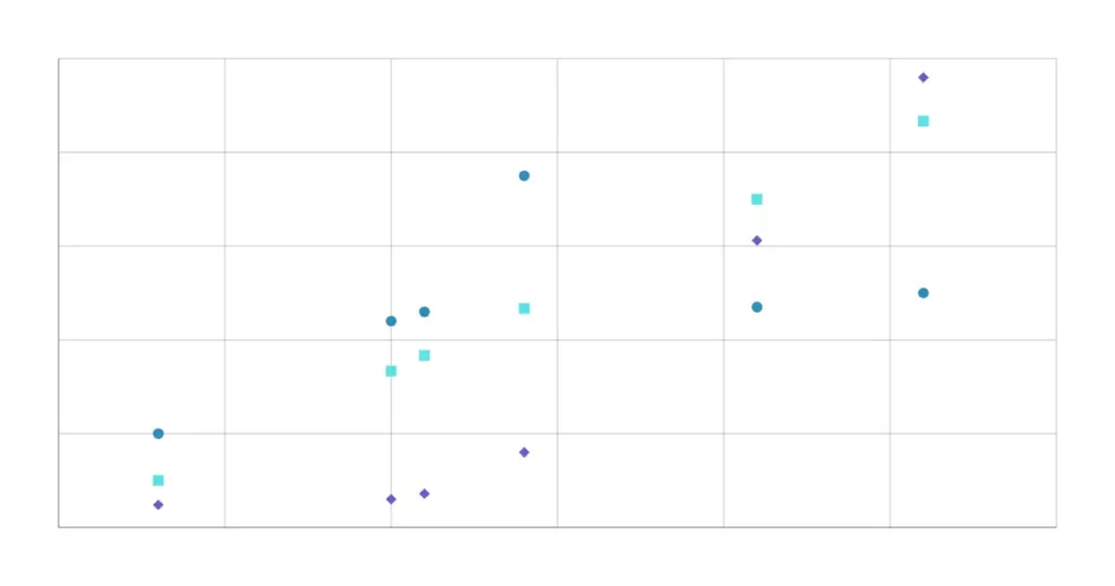
Basics of Stratification Charts
Definition and Purpose
Stratification Charts are analytical tools used to separate data into different layers or categories to identify patterns and relationships that may not be visible in aggregated data. The purpose of stratification is to make it easier to understand and analyze complex data by breaking it down into more manageable subgroups. This helps in identifying specific factors that may affect the overall results.
Importance in Separating Data
Stratification is crucial in quality control because it allows practitioners to isolate the effects of different variables. By separating data based on relevant criteria, such as time periods, shifts, equipment, or other factors, organizations can pinpoint the root causes of problems more accurately. This targeted approach helps in:
- Identifying variations between different strata.
- Understanding the impact of specific factors on the process.
- Making more informed decisions based on detailed analysis.
Creating Stratification Charts
Step-by-Step Guide
- Identify Data to be Stratified: Determine the data set you want to analyze and the criteria for stratification (e.g., by machine, shift, operator, etc.).
- Collect Data: Gather data according to the defined criteria.
- Organize Data: Arrange the data into separate layers based on the stratification criteria.
- Create Charts for Each Stratum: Plot the data for each stratum separately using appropriate charts (e.g., bar charts, line charts, histograms).
- Compare and Analyze: Compare the charts for different strata to identify patterns, differences, and potential issues.
Best Practices for Data Stratification
- Choose Relevant Criteria: Select criteria that are meaningful and relevant to the problem or process you are analyzing.
- Ensure Consistency: Maintain consistency in data collection and stratification methods to ensure accurate comparisons.
- Use Visual Aids: Utilize charts and graphs to visualize data for easier interpretation.
- Involve Stakeholders: Engage team members and stakeholders in the stratification process to gain diverse insights and perspectives.
Applications and Examples
Examples from Different Industries
In manufacturing, stratification charts can be used to analyze defect rates by shift. By stratifying the data, a company might discover that defects are higher during the night shift, indicating potential issues with staff training or equipment maintenance during that period.
In healthcare, stratification can help analyze patient outcomes based on different treatment methods. By separating data based on treatment type, hospitals can identify which methods are most effective for specific conditions.
Case Studies Demonstrating the Use of Stratification Charts
Consider a case study from a call center analyzing customer satisfaction scores. By stratifying the data based on call duration, the company discovered that longer calls were associated with lower satisfaction. This insight led to efforts to streamline call handling processes, resulting in improved customer satisfaction.
Advanced Tips and Hacks
Combining Stratification with Other QC Tools for In-Depth Analysis
Stratification charts can be combined with other QC tools to enhance analysis:
- Pareto Charts: Use stratified data to create Pareto Charts for each stratum, helping to prioritize issues within specific categories.
- Control Charts: Monitor stratified data over time using control charts to identify variations within different strata.
Using Advanced Statistical Methods for Enhanced Stratification
Advanced statistical methods can further improve stratification:
- Multivariate Analysis: Use techniques like multiple regression or factor analysis to identify relationships between multiple variables simultaneously.
- Cluster Analysis: Group data into clusters based on similarities, allowing for more nuanced stratification.
By leveraging advanced statistical methods, organizations can gain deeper insights into their data, leading to more effective problem-solving and process improvements.
Stratification charts are powerful tools for dissecting complex data sets, enabling organizations to identify specific factors influencing their processes. When combined with other QC tools and advanced statistical methods, stratification provides a comprehensive approach to quality control and continuous improvement.
Conclusion
Summary of the 7 QC Tools
Throughout this article, we’ve explored the seven fundamental Quality Control (QC) tools that are indispensable for maintaining and improving quality across various industries. Here’s a quick recap of each tool and its significance:
- Cause & Effect Diagrams: Also known as Fishbone or Ishikawa diagrams, these help identify root causes of problems by categorizing potential causes into major areas such as Methods, Machinery, People, Materials, Measurement, and Environment.
- Check Sheets: Simple forms used for real-time data collection and analysis, ensuring accuracy and consistency. They are crucial for tracking defects, frequencies, and other data points.
- Control Charts: Graphical tools used to monitor process stability over time. By identifying variations within control limits, they help maintain consistent quality and detect issues early.
- Histograms: Bar graphs that show frequency distribution, providing a visual representation of data variability and central tendency. They are essential for understanding the spread and shape of data distributions.
- Pareto Charts: Based on the Pareto Principle (80/20 rule), these charts help prioritize issues by identifying the most significant factors contributing to a problem.
- Scatter Diagrams: Graphs that depict the relationship between two variables, helping to identify correlations and potential causations. They are useful for understanding how changes in one variable may affect another.
- Stratification Charts: Tools for separating data into different layers or categories to identify patterns and relationships. They are crucial for isolating the effects of different variables and gaining deeper insights.
Integration and Synergy
The 7 QC Tools are not meant to be used in isolation. Their true power lies in how they complement each other, creating a comprehensive quality control strategy. For instance:
- Combining Cause & Effect Diagrams with Check Sheets: To identify root causes and then collect data on their occurrence.
- Using Control Charts and Histograms Together: To monitor process stability and understand data distribution.
- Integrating Pareto Charts with Scatter Diagrams: To prioritize issues and then analyze the relationship between key variables.
By strategically implementing multiple QC tools, organizations can achieve a more robust and effective quality management system. This integrated approach ensures that problems are not only identified but also understood and addressed at their root causes.
Future Trends and Innovations
Emerging Trends in Quality Control
The field of quality control is continuously evolving, driven by advancements in technology and changing industry needs. Some emerging trends include:
- Big Data and Analytics: Leveraging large datasets and advanced analytics to gain deeper insights into quality issues and predict future trends.
- Automation: Implementing automated systems for data collection, analysis, and reporting to improve efficiency and accuracy.
- Sustainability: Integrating quality control with sustainability initiatives to ensure environmentally friendly and socially responsible practices.
The Role of Technology in Advancing QC Tools
Technology plays a crucial role in advancing QC tools and methodologies. Some ways technology is enhancing QC include:
- Machine Learning and AI: Using artificial intelligence to identify patterns, predict outcomes, and optimize processes.
- IoT (Internet of Things): Connecting devices and systems to collect real-time data and monitor process performance continuously.
- Cloud Computing: Enabling remote access to quality control tools and data, facilitating collaboration and data sharing across teams and locations.
As technology continues to evolve, it will provide new opportunities and capabilities for quality control, helping organizations achieve higher standards of quality and efficiency.
In conclusion, the 7 QC Tools are essential components of any effective quality management system. By understanding, integrating, and leveraging these tools, organizations can address quality issues comprehensively and proactively. As we look to the future, embracing technological advancements will further enhance our ability to maintain and improve quality, ensuring that products and services consistently meet or exceed customer expectations.
FAQs
What is the main purpose of the 7 QC Tools?
The 7 QC Tools are designed to help organizations identify, analyze, and address quality issues within their processes. They provide systematic methods for data collection, analysis, and problem-solving, leading to improved product and service quality.
How do Cause & Effect Diagrams help in problem-solving?
Cause & Effect Diagrams, also known as Fishbone or Ishikawa Diagrams, help in problem-solving by visually mapping out all potential causes of a problem. This structured approach makes it easier to identify root causes and address them effectively.
In what ways can Check Sheets be customized for specific needs?
Check Sheets can be customized by including specific data categories relevant to the process being analyzed, adjusting the format for ease of use (e.g., paper-based or digital), and adding fields for additional notes or observations. This customization ensures the Check Sheets capture the most pertinent data for the specific context.
Why are Control Charts important in maintaining process stability?
Control Charts are important because they monitor process performance over time, helping to identify variations that may indicate problems. By maintaining control limits, organizations can ensure processes remain stable and any deviations are promptly addressed.
What insights can Histograms provide in quality control?
Histograms provide insights into the frequency distribution of data, showing how data points are spread across different intervals. They help in understanding the central tendency, variability, and shape of the data distribution, which is crucial for identifying patterns and making informed decisions.
How do Pareto Charts assist in prioritizing quality issues?
Pareto Charts assist in prioritizing quality issues by highlighting the most significant factors contributing to a problem. Based on the Pareto Principle (80/20 rule), these charts help organizations focus their efforts on the few causes that will have the greatest impact on improving quality.
What is the difference between correlation and causation in Scatter Diagrams?
Correlation in Scatter Diagrams indicates a statistical relationship between two variables, where changes in one variable are associated with changes in another. Causation, however, implies that changes in one variable directly cause changes in the other. While Scatter Diagrams can show correlation, additional analysis is needed to establish causation.
What are some common criteria for data stratification in Stratification Charts?
Common criteria for data stratification include time periods, shifts, equipment, operators, geographic locations, and product types. Stratifying data based on these criteria helps in identifying specific factors affecting process performance and quality.
How can technology enhance the use of the 7 QC Tools?
Technology enhances the use of QC tools by providing advanced data analysis capabilities, real-time monitoring, and improved data accuracy. Tools like machine learning, IoT devices, and cloud computing facilitate better data collection, analysis, and collaboration, leading to more effective quality control.
What are the future trends in quality control?
Future trends in quality control include the integration of big data and analytics, increased automation, and the emphasis on sustainability. Advancements in technology, such as artificial intelligence and machine learning, will continue to drive innovations in quality control, enabling more precise and proactive quality management.